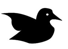
It’s been interesting getting feedback on the logo design I posted recently. Thank you for the good suggestions and even the prototypes people sent, everyone has been very helpful. I asked for comments and received quite a few. Just interesting to note that comments to most people means critique and analysis. Comments could also include things like impressions, and, what’s good about it. At any rate, I’m going to post several images below and I’m looking for more comments on which of the following holds the most promise. These are not finished or polished designs, more shapes and prototypes.  So please, kindly, let me know. The top one let’s call “water” the middle let’s call it “flight” and the last (the original shape) let’s just call original.
Â


8 responses to “Alternate Logo Prototypes for Peregrine”
for what it’s worth, i like ‘flight’ best, then comes ‘original’. the first one, ‘water’, reminds me too much of the Twitter logo, but that might be your intention, actually.
Hey Gregg, very interesting venture. Congratulations. I like the middle one best of all because the shape suggests upward flight, direction, and purpose. Its nature is non-threatening. Opportunities for improvement include how to give it a more distinct personality. Good luck!
I vote for middle!
Hi Gregg,
would love to help out in any way… so far the middle one soars… suggesting ideas taking off… i would build off that one! best wishes
Russ
Thanks Russ, Anne, Mark and Rimone. I’ll start working with “Flight”.
Reminder to those reading these comments. If you want to be involved with this new venture, follow @greggfraley2 on Twitter. And, subscribe to this feed for on-going information about The Peregrine Panel.
My vote goes to the 2nd image.
I’m still not sold on it.
Just another thought – if the ‘pitch’ is online then the logo could have movement.Also, I’d like to see a bit of feathering (to the back edge of the wings). I’m fine about the silhouette approach.
As always, my comments are perhaps ‘out of court’ and I have a number of ideas about this, including design options but no way of producing or transmitting. So not much good huh?
I’m therefore happy to follow the lead on this. I guess this is a bit if an initial Peregrine test, following panel rules and a democratic approach.
If we can’t efficiently deal with this then what hope eh? Gregg – you have my vote to take an executive decision.
observations, because I don’t think that hearing about what someone “likes” counts for much, unless you know who they are.
The “original” looks like binoculars (partly because it’s surrounded by a shape) & looks like it’s based a seabird; particularly a gull. People have called gulls are air-rats! But gulls also make nice ocean sounds.
The middle one “flight” is in action, but could be responded to as if it is a bird of prey in silhouette; so keywords for that are “clear, seeking, soaring.”
The first image (water) is a bird at rest, presumably in water? A bird at rest is more vulnerable; also the curvy lines in the way the wing is curved makes it look more friendly and “old-fashioned”, as if it’s a carved chair-back design. It could fly, but it’s not flying now.
observations…
The “original” looks like binoculars (partly because it’s surrounded by a shape) & looks like it’s based a seabird; particularly a gull. People have called gulls are air-rats! But gulls also make nice ocean sounds.
The middle one “flight” is in action, but could be responded to as if it is a bird of prey in silhouette; so keywords for that are “clear, seeking, soaring.”
The first image (water) is a bird at rest, presumably in water? A bird at rest is more vulnerable; also the curvy lines in the way the wing is curved makes it look more friendly and “old-fashioned”, as if it’s a carved chair-back design. It could fly, but it’s not flying now.